

Ticket UI
This was a collaborative project between KTH, Konstfack and Zeam. The project aimed to redesign Zeam's payment solution with a sharp focus on improving the
customer experience from the planning stage of the journey to the purchase and ticket validation before boarding the vessel.

The scope included:
- Enhancing the overall journey from journey planning, ticket purchase, to ticket validation, combining hardware and software.
- Developing an intuitive, user-friendly and visually appealing payment interface.
- Working closely with our payment technology provider.
- Ensuring that the design aligns with Zeam’s branding and aesthetic guidelines.
The UI was made completely in Figma and assets were specifically created for this project unless provided by the company brand guide. The UI is currently in use on Zeam's autonomous ferry in Stockholm.
One important suggestion for the interface was related to uncertainty regarding purchase success. Specifically, users requested that purchases would be validated or could be proven if necessary. As such, it was decided that a ticket validation feature be added. Keeping in mind that the majority of Zeam’s customers are tourists, the idea of giving validation the double purpose of serving as a memento was proposed. This idea in combination with the fact that Zeam’s mother company Torghatten was founded in 1878 laid the foundation for a validation system that uses digital old-fashioned style tickets.
More about the design
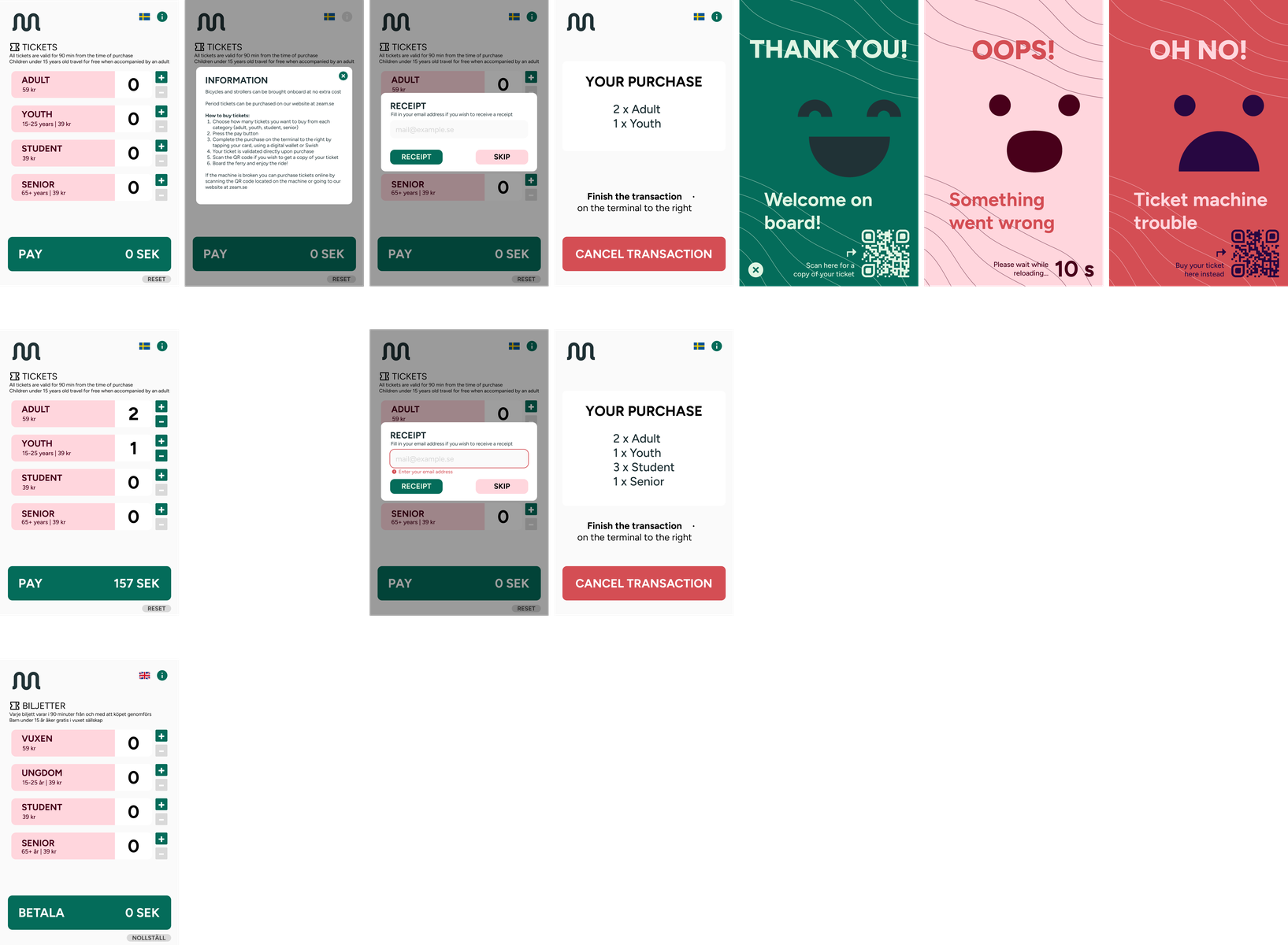
The user flow was designed to be efficient, clearly guiding the user along the primary expected ticket purchase path, but also allowing for quick recovery from user errors (e.g. selecting wrong number of tickets) by making return and abort buttons readily available. Zeam’s colour scheme was integrated to make interface elements pop, with dark green used as the accent colour for calls to action. Low-information views were also made to utilize animations. To attract attention the "waiting" view was made to prominently display the Zeam logo surrounded by an animation of one of Zeam’s brand element to stand out on the dock and beckon users. A confetti animation was also made to make the "payment successful" view more pleasing and unexpected.
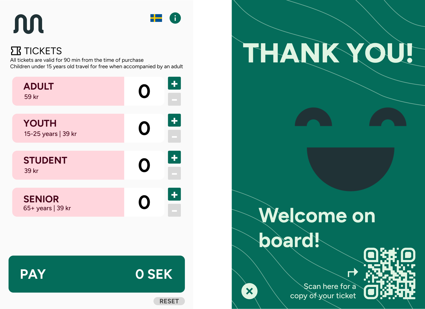
The most fundamental view is the one customers are first presented with upon approaching the ticket machine. All necessary information needed to make a purchase is presented on this screen: ticket categories, ticket pricing, number of tickets, validity and pay button. The view also offers additional functionality through the general information-, select language- and reset buttons. Only the supporting logo is displayed in this view in order to minimise competing elements.
The reset button at the bottom right can be used by the customer to reset the selected tickets simultaneously. Additionally, the page refreshes (resets all selected tickets) after a certain amount of inactivity. These parallel features were proposed to prevent customers having to manually return the tickets to zero if someone before them didn’t finish their purchase, or someone put in the maximum number of tickets in all categories as an act of “vandalism”.
The Thank you-screen serves as an important juncture and required the most consideration, as it is the one customers are presented with after finishing their transaction and needs to reassure them that they’re finished. A green background colour was chosen to signal users to "go ahead" while also using call to action text cues ("Welcome on board!") to convey that they’re done with their purchase. Additionally, Zeam's mascot is used to communicate feelings, in this case happiness towards the customer, and add warmth. The distribution of the interface components is based on the Z-shape line of vision pattern: users tend to parse poster pages, similar to the view here, in a Z pattern (starting at the top left) - thus, customers are expected to first read the messages and finally end up at the QR code in the bottom right corner.
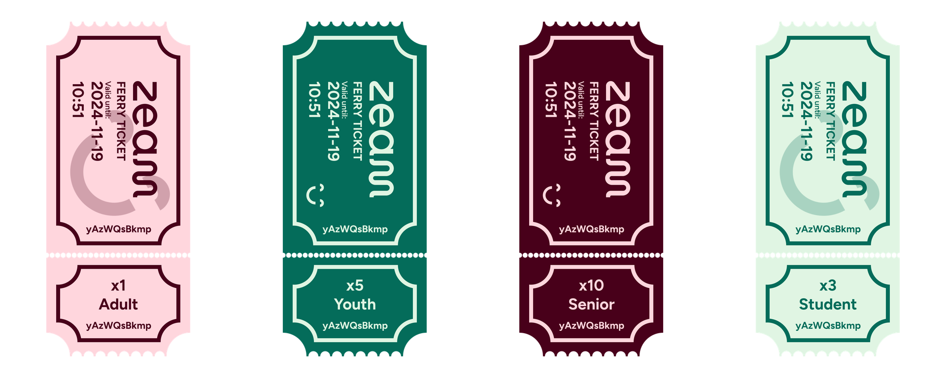
When a user scans the QR code, they receive an image file on their phone containing the ticket purchased. If tickets in different categories were purchased they are displayed in a carousel style. The tickets contain the validity, a unique ticket number, number of tickets purchased and what category. This information is generated, along with the QR code itself, at the time of purchase and put on the base image of the ticket. The tickets are colour coded depending on category, which makes it easy to differentiate the tickets at a mere glance. Zeam's mascot was incorporated to brighten up the ticket design and convey warmth towards the customer, while the full logo is prominently displayed for branding purposes.